Tracking the Variants
We have been informed today, in addition to spreading more quickly, it also now appears that there is some evidence that the new variant - the variant that was first identified in London and the South East - may be associated with a higher degree of mortality
~ Boris Johnson
It's all going to be about the [COVID-19] variants and the vaccine, and that will determine where we're going to be next year, the year after, and the year after that.
~ CBS, Mar 12, 2021
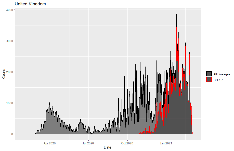
The Covid-19 variant B.1.1.7, aka the UK variant has been making news for the last few months. B.1.1.7 is estimated to be 40%–80% more transmissible than wild-type SARS-CoV-2 and was detected in the UK in November 2020 from a sample taken in September.
I wanted to take a look at its development so I downloaded the latest data from GISAID on March 18, 2021. The data included a tab delimited meta file containing 769,387 observational rows of 28 variables. The first things I wanted to look at was the time course of the variant in the USA and the UK.
B.1.1.7 has an E484K mutation in the spike protein. This mutations is concerning because it is postulated to reduce vaccine effectiveness.
I wrote a bit of R code to extract the rows from a specific country of exposure and pangolin lineage, and summarize and count the data. The code could probably been simplified to avoid the intermediate data frames, but they make debugging easier.
#' filter_meta
#' filter GISAID meta file by pango_lineage and country of exposure.
#' Data is summarized by date and percent of linage for each date is calculated.
#' Optionally a plot of the lineage's per cent of the total samples can be displayed
#'
#' @param df - a GISAID metafile
#' @param country - country of exposure
#' @param lineage - pango lineage
#' @param plot - a boolean, TRUE to plot
#' @param title - an optional title for the plot
#'
#' @return df -a data frame
#'         with columns date, count of all lineage, count of chosen lineage, and pct of chosen lineage
#'
filter_meta <- function(df, country, lineage, plot = TRUE, title = NULL) {
  require(tidyverse)

  # filter by country and select columns
  df2 <- df %>%
    filter(country_exposure == {{ country }}) %>%
    select(date, country_exposure, pango_lineage) %>%
    group_by(date, pango_lineage ) %>%
    count()

  # count each linage by date
  df3 <- df2 %>%
    group_by(date) %>%
    summarize(count = sum(n))

  # filter by lineage
  df4 <- df2 %>%
    filter(pango_lineage == {{ lineage }}) %>%
    ungroup() %>%
    select(date, n) %>%
    rename(lineage_count = n)

  # combine the tables
  df5 <- left_join(df3, df4) %>%
    replace_na(list(lineage_count = 0)) %>%
    mutate(pct = lineage_count / count) %>%
    na.omit()

  if(plot) {
    p <- ggplot(df5)  +
      geom_area(aes(x = date, y = count, color='All Lineages'), alpha=0.6 , size=1) +
      geom_area(aes(x = date, y = lineage_count, color = {{ lineage }}), alpha=0.6 , size=1) +
      scale_color_manual("", breaks = c('All Lineages', {{ lineage }}), values = c('black', 'red')) +
      ylab('Count') +
      xlab('Date')

    if(! is.null(title)) {
      p <- p + ggtitle(title)
    }

    print(p)
  }

  return(df5)
}
We can see how B.1.1.7 took over the United Kingdom data in this plot.
In the US, story is different. The variant hasn't yet become dominant in the data.


Comments
Post a Comment